Visme: The only data visualisation tool you will need for project management
Managing one project is no easy feat, no matter what the scope and scale are. While creating a project management plan, few necessary steps need to be followed. Obstacles may occur during each phase and prolong the whole process.
Dividing the project into manageable stages, each with its deliverables and down goals, it becomes easier to control the quality of the output.
Dividing the project into manageable stages, each with its deliverables and down goals, it becomes easier to control the quality of the output.
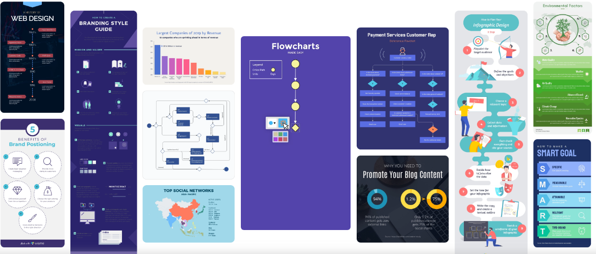
![Different diagrams on a sheet of paper. [1]](https://www.iapm.net/uploaded_files/_managedByElements/title-visme_id32945.jpg?@1260x1260/rpo "Different diagrams on a sheet of paper. [1]")
Simple tips to project management success
Good project management will help you reach your goals rather than just tracking tools and databases. Communication, collaboration, self-awareness, curiosity, documentation, and flexibility are just a part of the project management best practices.
It is important to:
It is important to:
- Develop a project plan with the roles and responsibilities clearly defined
- Identify the project requirements - project resources are the key factors that contribute to doing a project successfully
- Provide the life cycle of a project with phases such as planning, execution, and closure
- Ensure that the communication between the team members and you is always open
- Identify potential risks in timeTest deliverables to determine whether it is meeting or exceeding the expectations
Almost 50 % of the projects fail
Big companies admit that almost 50% of the projects fail to meet the primary three key goals – schedule, quality, and budget. Therefore using data visualization tools in project management is beneficial for the organization.
A software tool that will help you with the project management plans design is Visme.
A software tool that will help you with the project management plans design is Visme.
What is Visme?
Visme is an online tool for creating, storing, editing and sharing, visual materials. You can use Visme as a presentation app to make slide decks and create a storyboard templates, infographics, and charts.
Visme also has an option to visualise data or other types of knowledge for your social media posts.
Visme also has an option to visualise data or other types of knowledge for your social media posts.
How can data visualisation be used during a project?
Scrolling through a massive amount of data may be tiring. Wasting time, accomplishing less is not what anyone in project management is aiming for. Visualising the exact data in responsive and interactive visuals will boost work efficiency.
Data visualisation tools assist in projecting data in interactive formats like line charts, graphs, infographics, scatter plots, and so on.
Data visualisation tools assist in projecting data in interactive formats like line charts, graphs, infographics, scatter plots, and so on.
What makes data visualisation so crucial for project management?
Visualised data can help make planning more accurate. There is no doubt that project management data visualisation is going to save you time.
This ensures that all of the parties working on a project are on the same page. You don’t need a dozen of different conversations across email and more data points in a spreadsheet elsewhere.
Data visualisation simplifies things making it easy to see large amounts of data all in one place. It helps team members understand trends and make quicker decisions by locating all of the information and transforming large data sets into interactive charts or attractive infographics.
When your data is arranged on graphs visually, and metrics are easy to read, no data gets lost.
Better than plain text visuals leave a better impact on onlookers. When you understand a project in a better way, you can comprehend it in the best possible manner. This specific concept works wonders for teams involved in project management.
Better than plain text visuals leave a better impact on onlookers. When you understand a project in a better way, you can comprehend it in the best possible manner. This specific concept works wonders for teams involved in project management.
How to visualise a project plan
Project management is depending on few moving parts, making it essential to stay organised. A complete project management plan will ensure that you are communicating the aim of the project and at the same time keeping team members informed.
One of the best tools you can turn to for a smooth-running process is visual project management.
Why are visuals so compelling? That is because our brain can process images in only 13 milliseconds, helping us interpret information with ease.
One of the best tools you can turn to for a smooth-running process is visual project management.
Why are visuals so compelling? That is because our brain can process images in only 13 milliseconds, helping us interpret information with ease.
Use an organisational chart to visualise team structure
Everyone has to be clear about their role in the project. If used well, organizational charts become great at visualizing hierarchical lines and even more complex matrix arrangements.
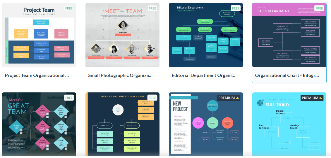
Organisational charts specifically help in supervisory communication, then in restructuring and planning. Having a transparent visualisation of your workforce and operations can reveal inconsistencies and organisation gaps. This can encourage restructuring efforts if needed.
Visual representations of the workforce and structure make it a lot easier to plan your next steps.
Visual representations of the workforce and structure make it a lot easier to plan your next steps.
Project status reports

Project status reports are monitoring the progress of a project. A status report will show planned vs. actual progress. This is the best place to follow up and to document any issues or risks. A report can keep track of milestones and keep an eye on the project’s budget.
With data visualisation software like Visme, you will build custom reports that monitor every part of the project management process.
With data visualisation software like Visme, you will build custom reports that monitor every part of the project management process.
Knowing when to create a chart
There will always be instances where you will have statistics and data that you want to share no matter what you are creating. Showcasing this data with a chart will provide a much better way for your team members to understand an argument.
You can use a lot of different types of charts to add visual elements to words and numbers. There are organisational charts and numerical charts that will help you visualise your thoughts and ideas.
You can use a lot of different types of charts to add visual elements to words and numbers. There are organisational charts and numerical charts that will help you visualise your thoughts and ideas.
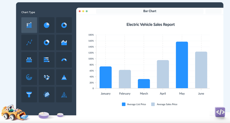
What is a chart in project management?
Project management charts visually represent data that turns complex project management concepts into something much easier to understand. Mainly they are used for project planning and can take many shapes such as flowcharts, bar charts, or network diagrams.
Use a standardised collection of shapes and symbols to display each step in the project process. Once complete, your flowchart is ready to help you and your team analyse and carry out specific objectives and project plans.
Use a standardised collection of shapes and symbols to display each step in the project process. Once complete, your flowchart is ready to help you and your team analyse and carry out specific objectives and project plans.
A project management process flowchart
A flowchart helps to visualise the steps that should be followed throughout the whole project management process.
Once you have developed the process flow, this chart will guide the primary phases of any projects in the future, from start to finish. With this guide in place, your team will always know what comes next, and your process will function smoothly and efficiently.
Once you have developed the process flow, this chart will guide the primary phases of any projects in the future, from start to finish. With this guide in place, your team will always know what comes next, and your process will function smoothly and efficiently.
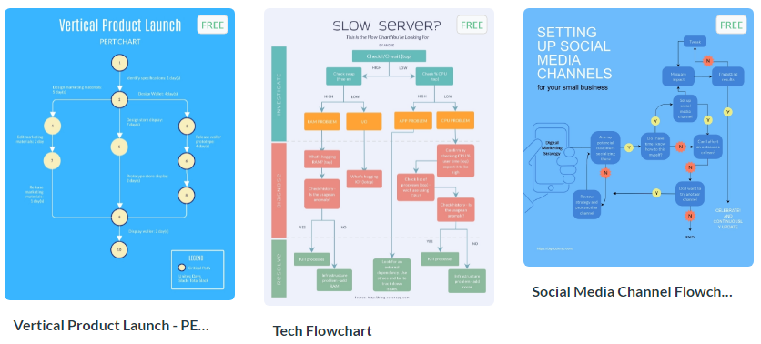
Using a flowchart to document your project visually allows you to:
The purpose of making a flowchart is to visualise all required steps – especially those critical for a project management process. Every flowchart consists of inputs and outputs for every step of actions and the role responsible for executing those actions.
- Highlight potential workflow issues
- Illustrate parts of tasks required for their completion
- Uncover areas where efficiency or output should be improved
The purpose of making a flowchart is to visualise all required steps – especially those critical for a project management process. Every flowchart consists of inputs and outputs for every step of actions and the role responsible for executing those actions.
How to turn raw data into great data visualisations
Data visualisation is a great way to see how one business is running and get an instant picture of how outside influences may impact their business performance.
Poorly designed data presentations may distort the message, lose people’s attention, and fail to guide them to meaningful conclusions.
Compelling data visualisations do more than just looking nice or attracting attention. They are telling stories that increase understanding.
They provoke thought, present insight, and spur action. There are few things to take care of when turning raw data into great data visualisations.
Know what you want to say
Don’t make team members “interpret” your message. Mixed messages will leave your audience confused. Deliver a strong message by focusing on the presenting data to ensure a central theme emerges.
Combine tables & charts with text
Don’t overwhelm users with too much information. Enable them to recognize patterns easily by combining tables & charts with text.
Create a good story
The way you present and organise your content can provide a clearer understanding. Group your visualisations so that every element on graphics reinforces your message. Ensure every visualisation and metric is relevant, so viewers can easily conclude.
Make sure your visualisation follows natural eye movement. Don’t forget about data hierarchy - place high-level visualisations at the top and detailed visualisations at the bottom.
Add colour to the story
Use colour in data visualisations to show your team members what question you are answering. Colour coding is a great tactic to draw attention to the group elements, valuable points, create hierarchies, and separate information sections.
For instance, you can choose a specific colour to separate tasks, timelines, or departments to help communicate and better organize your ideas.
However, take care of not making the common mistake of going overboard with colour. It’s essential to select a compatible colour scheme that helps the reader understand you instead of confusing them.
It’s a good idea to choose a colour like blue or green for the background and warm colours like red, orange as a contrast.
Communicate effectively
Data visualisation is a fantastic technique for facilitating collaborations and improving communication in the project team.
When you share information in the proper form of interactive visuals, every team member can quickly understand these visuals, identify an expected course of action, and implement effective strategies.
When you share information in the proper form of interactive visuals, every team member can quickly understand these visuals, identify an expected course of action, and implement effective strategies.
Conclusion
How many projects failed because they were not able to utilise available data effectively?
The data visualisation tools assist you in accessing well-arranged information, therefore use them to gain valuable insights and make quick decisions.
The data visualisation tools assist you in accessing well-arranged information, therefore use them to gain valuable insights and make quick decisions.

Author: Nina Petrov is a content marketing specialist, passionate about graphic design, content marketing, and the new generation of green and social businesses. She starts the day scrolling her digest on new digital trends while sipping a cup of coffee with milk and sugar. Her white little bunny tends to reply to your emails when she is on vacation.
Keywords: Project management, tip, software